IEEE VIS 2015 in Chicago
Thanks to the fruitful work with Tamara Munzner and Matt Brehmer at UBC, our paper about TimeLineCurator made it into the VAST track of this year's IEEE Vis Conference, which was held 25 - 30 October in Chicago.

Besides Chicago being a wonderful city, the conference was super exciting! The whole week was jam-packed with workshops, panels and paper presentations. There were always at least three things happening at the same time, so it was pretty much hopeless to attend everything of one's interest.
What's VIS?
Quick newbie summary
It's an academic conference, which in contrast to those rather commercial conferences I attended so far (FMX, jQueryUK, goto; conference, push.conference) is primarily about research and science - thus the focus isn't neccessarily on applications. (Even though it apperently is getting more in that direction now, which means that many research projects now have their code publicly available on GitHub and/or offer prototypes or even full applications online.)
The topics that are covered are all about visualization, but split in three bigger subsets, which are:
The IEEE in front of it all means "Institute of Electrical and Electronics Engineers" and that is the world's largest association of technical professionals to take care about "educational and technical advancement of electrical and electronic engineering, telecommunications, computer engineering and allied disciplines" [wikipedia].
So that said: I took notes of sessions that I attended during the week and try to outline them here. With many links and some qualified and/or clumsy comments.
Keynote: Donna Cox
An Evolving Visual Language
 The opening keynote was given by Donna Cox, director of the Advanced Scientific Visualization Laboratory at the University of Illinois. Her endeavor is basically to bring science closer to the broad audience using computer visualizations. She and her team created elaborate animations of nature phenomenons, like solar superstorms, or galactic center orbital models and inner stellar distributions. Those productions even ran in IMAX theaters and famous voices like Bendedict Cumberbatch's explain what is shown. She emphasized how important it is to think about the storytelling factor if your goal is to deliver something to non-domain experts like the general public, and you have to include them, show them how they fit into the picture and make them participate. Everybody can become part of the story like that.
InfoVis track
Suggested Interactivity
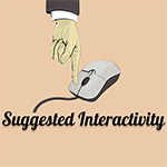 This paper by Jeremy Boy and his Aviz group from INRIA investigated in a problem that I also noticed regularly, while I was creating interactive graphics at the newspaper. People often like those colorful graphics, but it happens quite often that the reader doesn't even realize the possibility of interaction within them. Either because they don't care too much about the topic, or - and that's something that should be solved - just because it is not clear to them, that there is something to interact with. The paper suggests you could use little indicators to point readers to the interactivity. And then people also need to know what’s gonna happen through interaction - so that they don't have to fear surprises when interacting. They tried several approaches and created a nice interactive collection.
Vega, Voyager and Polestar
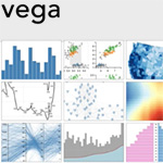 Jeffrey Heer and his Interactive Data Lab at the University of Washington presented a few things. "Voyager: Exploratory Analysis via Faceted Browsing of Visualization Recommendations" was one of their papers. Voyager suggests automatically generated visualizations, based on a gallery of recommended visualizations, and lets the user navigate interactively. It should help discover unknown data and support finding the right questions to ask. Another paper "Reactive Vega: A Streaming Dataflow Architecture for Declarative Interactive Visualization" introduces how Interaction should become more part of the declaration process already. Those projects are all part of Vega - A Visualization Grammar and it is all open sourced on github.
Beyond Memorability
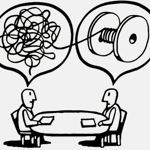
 Michelle Borkin and her group investigated the factors that make visualizations effective. What components within the visualization affect its memorability, recognition, recall, and comprehension? They created a huge labeled dataset of 393 visualizations and conducted a user study, where they found out the following: 1. titles are important (the more precise, the better to recall), 2. pictograms can (if used with care) help the understanding and improve recognition, and 3. redundancy helps. The paper ("Beyond Memorability: Visualization Recognition and Recall") was discussed vividly afterwards, because maybe memorable visualizations don't necessarily have to be effective ones? But they can be!
Ha! @FILWD gets in line to ask question about memorability of content v image and the first person beats him to it! #ieeevis
— Jon Schwabish (@jschwabish) 29. Oktober 2015
Five Design-Sheet methodology
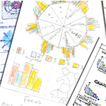 Jonathan C. Roberts and his Visualization and Medical Graphics Group wanted to add sturcture to an otherwise unstructured process - namely the design process. They suggest you should use 5 sheets, where the first one is for brainstorming, second, third, and fourth are for initial designs, the last one for the realization design then. Those sketches don't have to be pretty, it's about communicating the idea. And even though you might think they are not very important at the moment, you'll probably return to those sketches at a later stage of the project, to comprehend or to explain previous decisions. So, yay, structure!
Poemage
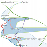 Nina McCurdy and her fellows from the University of Utah build Poemage for "Visualizing the Sonic Topology of a Poem". They asked questions like: How can you extract meaning in a peom? What generates meaning in a poem? And how can machines help there? The nice thing about this talk was that it showed it’s not always just about solving something or to make interpretation easier, but sometimes it could be just about discovering new interpretations and get inspiration. So even poetry can benefit from computational tools, for example to support what is called distant reading.
Learning Visualizations by Analogy
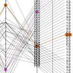 Puripant Ruchikachorn and Klaus Mueller from the Stony Brook University used a morphing approach to explain different types of visualization by animating there from familiar visualizations. Their paper "Learning Visualizations by Analogy: Promoting Visual Literacy through Visualization Morphing" explains that approach for example with how a data table translates into parallel coordinates, or how a scatterplot matrix can also be displayed as a hyperbox. The video shows the idea pretty neatly.
VAST track
Personal Vis
 Since we are very good with producing lots of data and tracking stuff with sensors, now also in our personal life, there is a growing need for data analysis of this personal data. Several research areas already looked at it, but since those different areas don't play ball together too often, Melanie Tory and her research group looked at 66 papers from different conferences and used open coding to find similarities and metrics. They identified clusters of already existing tools, such as: For families, for curiosity, action trackers, community reflectors. The paper "Personal Visualization and Personal Visual Analytics" gives an overview of the current state of personal Viz and unites different research areas.
A few interesting questions came up in the discussion afterwards, such as: People tend to not be experts in interpreting visualizations - how can you make sure that they don't misinterpret their own, let's say, heart rate data and draw wrong conclusions. Or how can you make sure that they don't take system predictions as cut in stone, without taking into account that measurement errors can happen. And: How would a system handle "bad news" - should it be blunt or rather try to encourage people by prettifying results?
Visualizing your Notes
 Melanie Tory was also the chair of one whole session about Personal Visualization (IEEE Computer Graphics And Applications Paper Session), with some more interesting Projects. E.g. one paper about how people take notes ("Understanding Digital Note-Taking Practice for Visualization"), and what potential lies in visualizing that data. They built "Medley", an application that uses your Evernote notebooks and generates visualizations. Like your usage of Evernote over time, or at what time of day you were most active in note taking. The challenge is in the heterogeneity of notes, but one can see many more use cases: like visual summarizations of the content, highlighting connections between notebooks, keyword visualization to support recall of the notes, and the like.
Sensemaking in Qualitative Analysis
 In the paper "SensePath: Understanding the Sensemaking Process through Analytic Provenance" Phong Nguyen and his team from the Interaction Design Centre at Middlesex University London, want to find a way to speed up the sensemaking process during qualitative analysis. Their prototype application SensePath links different views and shows all sensemaking actions in temporal order to support further analysis, find meaning and gain insight.
Capstone: Molly Wright Steenson
Architectures Physical and Digital
 The closing capstone was given by Molly Wright Steenson, an associate professor at Carnegie Mellon's School of Design. She gave a quite quote-heavy talk about how architecture and computing relate, and how they evolved. Christopher Alexander was quoted several times and she explained why he is hated by architects and loved by designers. Since architecture also refers to building computer systems, it can be defined as building complex systems and taking care of structure. And I'll end with a quote (not too sure anymore, if she actually mentioned that particular quote in her talk - but it would have fit):
"Speaking as a builder, if you start something, you must have a vision of the thing which arises from your instinct about preserving and enhancing what is there."
- Christopher Alexander
All in all
What a week
It was an overwhelming week full of content, community and get-togethers. It was exciting to give a presentation in this fancy environment, and in front of so many smart people. I took an infinite amount of notes, got so much inspiration and want to read up on so many things now. I met many incredibly friendly and canny people and am thankful for having had the opportunity of being part of it.
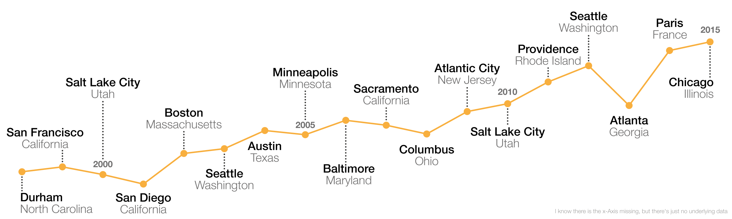
I wanted to end with an infographic containing some numbers of the conference... but it is pretty hard to find any. The following is the number of attendants over the last years (not complete, since the first VIS - or IEEE Conference on Visualization - was in 1990), and since there is no actual dataset, the numbers, or rather the trend is based on this picture from a tweet by Jonathan C. Roberts. Unfortunately the infographic, which was shown at the end of the conference didn't follow the design principles of having readable lables, so I can't tell the exact numbers, let alone the rough numbers. I think I heard something about a little over 1,000 attendants this year...??!